WL
MODULE 2: Flatness vs Projection
This module explored the interrelationship between two-dimensional images and three-dimensional projections. We are initially given two flat Mario images and asked to reimagine the world between these images using axonometric projection.


Fig. 2.01 Sketches from bullet journal

Fig. 2.02 Sketches from bullet journal
I began to conceptualise my Mario world by putting ideas down in a bullet journal.
As the world I was given consists of numerous coloured blocks, I wanted to experiment with the possibilities of the block form when it is translated from two-dimensional space to three-dimensional space.
I first looked at the way a curved block can still retain a rectangular frontality, and different ways I could create compositions with them. I was particularly interested in the works of Escher and used them as inspiration to manipulate geometric forms.
The dots of the bullet journal helped me visualise the geometry of the forms I wanted to create in axonometric projection. I was able to draw straight lines at 0, 45 and 90 degrees by hand, which made the brainstorming process much more fluid and natural.

Fig. 2.03 Set up of my axonometric drawing

Fig. 2.04 Further progress in my drawing, outlining in pen
In the drawing stage of my world, I already have a good idea of the kind of forms I would like to include, so I used the reference lines extended from the image to place my objects carefully, measuring them to be of the correct height and distance from each other.
When I presented my initial design to my tutor, I received the feedback that my ground level was too flat and lacked interest. So I extended various elements down below the ground, such as the pipes, to create further intrigue in my composition.
The revised drawing already looked much more interesting. I further added elements such as the liquid flowing out from pipes to make the composition more dynamic.

Fig. 2.05 Six central objects and colour palette
I then drew my six central objects in Illustrator and curated my colour palette. I added detail to my objects through the gradient, brush and pattern tools. I wanted my palette to be muted and convey an elegant aesthetic. The muted tones also complement each other, creating a sense of visual harmony across the composition.

Fig. 2.06 Screenshot of Illustrator tracing
The tracing step on Illustrator was a crucial learning process as I familiarised myself with the tools. I traced my drawing in three separate layers, with each layer made up of closed curves from left, right and top planes. This way, I have a clear sense of the surfaces, their interaction with the light source, and can colour them accordingly. I also made the lines for each plane a separate colour to ensure that I have traced every shape.
What I found extremely useful in my digital tracing was the smart construction guides set at 45 and 90 degrees. This meant that I was able to line up my anchors at 45 and 90 degrees to other anchors using the pen tool and draw accurate, closed shapes.

Fig. 2.07 Screenshot of manipulation of circular shap
One difficulty I tackled with was the drawing of pipes. In my design, the pipes involved three differently sized circles - one for the interior, one for the exterior, and one for the opening of the pipe. To make the process easier, I drew the three circles on a reference layer which I can constantly refer to.
The openings of pipes on the left plane were very difficult to visualise. So I instead drew a rhombus with side lengths of the circle’s diameter. Then, I used the ellipse tool to draw a slimmer circle, rotated it and further adjusted its size to fit inside the rhombus. This was a much more accurate method of drawing than approximating the curvature of the circle by eye.

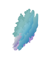

Fig. 2.08 Different stages of cloud rendering
Finally, I explored the different representations of the cloud mass - which is a large component of my Mario world. I first extruded them to construct an axonometric effect.
I then considered how the contrast between flattened clouds and the axonometric world could establish an interesting dissonance commenting on the childish nature of the Mario game. I also thought I can add a sense of ephemeral form through shearing the irregular shapes, adding gradients and adjusting opacity.

Fig. 2.09 Complete traced Mario world


Fig. 2.10 Quick colouring to reveal planes in drawing
I considered the way colour can be used to denote changes in the planes and surfaces, and experimented with colour values: after completing the tracing on Illustrator, I filled in the three planes with muted colours of orange, blue, and green. The three colours were able to quickly give me a sense of three-dimensionality and an overall idea of what my world would look like.

Fig. 2.11 Final axonometric illustration
Reflection
From this module, I was able to gain an extensive understanding of different methods of representation as well as digital tools which facilitate the illustration process. From the axonometric hand-drawing exercise, I realised how flat objects can actually be extruded in a number of different ways. Their depth, and to an extent, their form, are entirely dependent on the architect of the world. This is why everyone's Mario world would be different. I really enjoyed this exercise as I was able to imagine with creative freedom and construct my very own world - a world inspired by Escher and my personal experiences of the complex world.
Looking back at my work, I think I definitely can adjust my colour scheme so that the mountain range can be more easily distinguished from the blue and green building-like forms. In the future, I wish to delve further into the manipulation of forms and, subsequently, of spaces, through stimulating and challenging the boundaries of my creativity.
Transforming the two-dimensional image to a three-dimensional world has broadened the way I perceive images as I am now aware of the infinite possibilities that lie behind the flat facades. Axonometric projection reveals spaces previously concealed and clarifies the edges where one plane connects to another. However, through my own experimentation, it becomes evident that it is also a method to explore the incomprehensible - the omission of perspective has inevitably made perceptive illusions and the simultaneity of spaces possible.